Build faster with 2000+ components designed for Penpot
Kickstart any Business system or SaaS application in minutes with a complete design system featuring responsive components, design tokens, and Material Design guidelines—all built natively for Penpot.
Everything you need to design SaaS app at lightning speed
From rapid prototyping to production-ready designs, every component is built to accelerate your workflow while maintaining pixel-perfect consistency.
Everything you get with Labyrinth UI
Download FREE UI kit2000+ Assets
Access a massive library of components and icons, all ready to use in your next project.
Native Integration
Built specifically for Penpot with full support for tokens, Flex Layout, and component properties.
Lifetime Updates
Free updates forever as we continuously expand the library and add new features.
Building blocks for every interface
From simple buttons to complex data tables, Labyrinth UI provides every component you need to create professional SaaS interfaces. Each element is carefully crafted with Material Design principles and optimized for Penpot's native features, ensuring seamless integration and maximum flexibility in your projects.
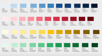
Colors
The colors meet WCAG 2.1 accessibility guidelines. They'll maintain sufficient contrast ratios for text legibility while providing a visually pleasing gradient.
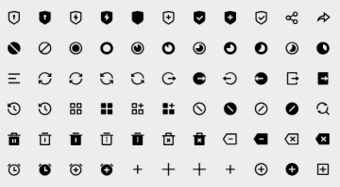
Icons
Fundamental elements of visual communication, helping users understand and interact with interface more intuitively and efficiently.
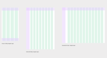
Layouts & Spacing
Layout grids define structure, hierarchy, and rhythm in your design.
Spacing is used to manage the space between consistently.
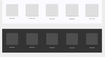
Shadows & Elevation
Shadows & elevation define depth and hierarchy, making elements appear to float. They consistently communicate visual priority and interactivity.
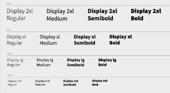
Typography
Typography defines the complete visual language of text and ensures all written content is consistently legible, readable and visually harmonious across interface.
Avatars
Avatars act as visual cues, helping to identify a person, a business, or an object, and contribute significantly to personalizing the user experience.