Building blocks for every interface
From simple buttons to complex data tables, Labyrinth UI provides every component you need to create professional interfaces. Each element is carefully crafted with Material Design principles and optimized for Penpot's native features, ensuring seamless integration and maximum flexibility in your projects.
Foundation components
The most atomic, low-level building blocks and guidelines that underpin all other UI components and patterns.
They are essentially the codified brand attributes and core visual styles that provide the system's aesthetic and functional bedrock.
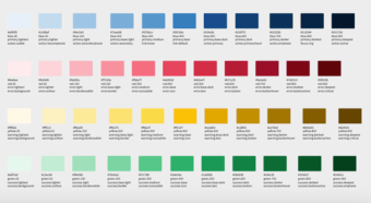
Colors
The colors meet WCAG 2.1 accessibility guidelines. They'll maintain sufficient contrast ratios for text legibility while providing a visually pleasing gradient.
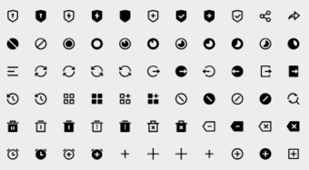
Icons
Fundamental elements of visual communication, helping users understand and interact with interface more intuitively and efficiently.
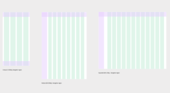
Layouts & Spacing
Layout grids define structure, hierarchy, and rhythm in your design.
Spacing is used to manage the space between consistently.
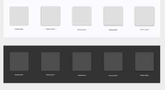
Shadows & Elevation
Shadows & elevation define depth and hierarchy, making elements appear to float. They consistently communicate visual priority and interactivity.
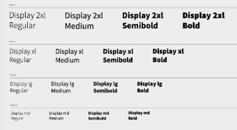
Typography
Typography defines the complete visual language of text and ensures all written content is consistently legible, readable and visually harmonious across interface.
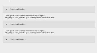
Accordion / Collapse
A content area which can be collapsed and expanded. Accordion is a special kind of Collapse, which allows only one panel to be expanded at a time.
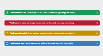
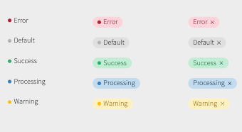
Alerts
Alerts provide timely and important feedback or information to users, guiding their attention without necessarily interrupting their workflow.
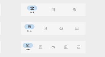
Avatars
Avatars act as visual cues, helping to identify a person, a business, or an object, and contribute significantly to personalizing the user experience.
App Bars
App bars are prominent UI containers typically placed at the top or bottom of a screen, providing access to key actions, navigation, and screen titles.
Badges
Badges are small, non-interactive UI elements that display a small amount of dynamic information, often overlaid on another component like an icon.
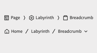
Breadcrumbs
Breadcrumbs are a secondary navigation component that help users understand their position in the site structure and easily navigate back to higher-level pages.
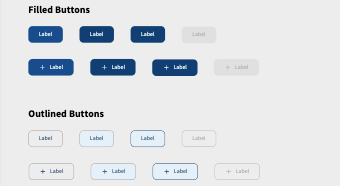
Buttons & Button groups
Buttons are interactive UI elements that allow users to trigger actions or navigate. Button groups organize multiple related buttons into a single, cohesive unit.
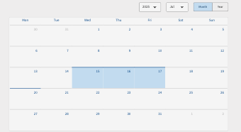
Calendar
A calendar UI component is an interactive element that displays dates in a grid-like format, allowing users to select specific dates or date ranges.
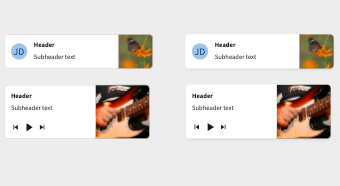
Cards
Cards are flexible, rectangular UI containers that group related content and actions into a digestible, visually distinct unit.

Carousel
A carousel (or slider) is a UI component that displays multiple pieces of content within a limited horizontal space, showing one or more at a time.
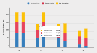
Charts
UI components designed to visually represent data, making complex information digestible through graphical means like bars, lines, or pies.
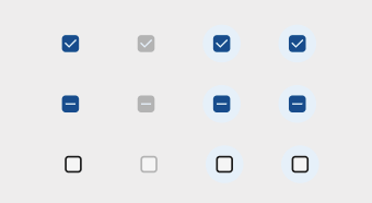
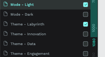
Checkboxes
Checkboxes are interactive UI elements that allow users to select one or more options from a list of choices, acting as a binary (on/off) switch for each item.

Chips
Chips are compact, interactive UI elements that are often used for input (like tags), selection (like filters) or to display attributes in a small, organized way.
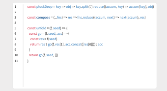
Code snippet
Code Snippets are UI elements that are made up of small blocks of code that can be reused, copied, and inserted into a code file.
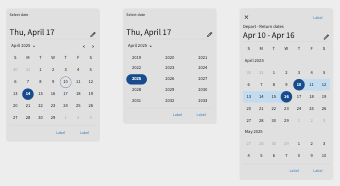
Date pickers
Date pickers enable users to select a specific date, or range of dates, typically via an interactive calendar or direct text input.
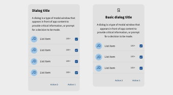
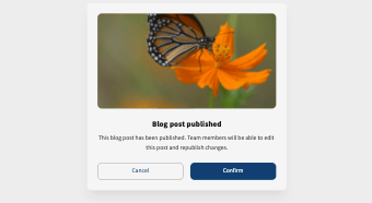
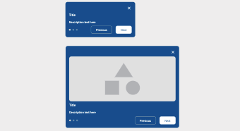
Dialogs
Dialogs appear on top of the main content, demanding immediate user attention for a critical action or specific piece of information.
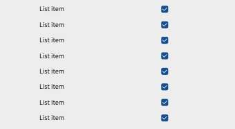
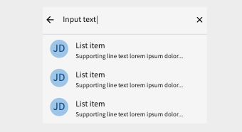
Lists
Lists efficiently present information, facilitate scanning, and often include interactive elements like links, icons, or actions for each item.
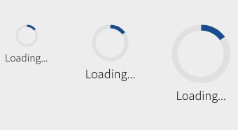
Loading indicators
A loading indicator is a UI component that visually communicates to the user that a system process is underway and they need to wait.
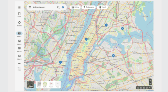
Map
A map component is an interactive element that displays geographical data, allowing users to view locations, navigate, and interact with points of interest.
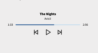
Media player
A media player component is a user interface element that provides controls for playing, pausing, and navigating through audio or video content.
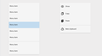
Menus
Menus efficiently organize options, from navigation links to contextual commands, into an easily scannable and accessible format.
Modals
Modals interrupt the user's current workflow to present critical information or require a specific action before the user can return to the underlying content.
Navigation
Navigation establish the information architecture, providing a clear path and sense of location regardless of the complexity of the digital product.
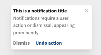
Notifications
Notifications inform users about events or updates that might not require immediate action, appearing briefly to provide subtle feedback.
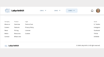
Page Header & Footer
Headers serving as a primary identifier and navigation hub. Footers are found at the bottom of a digital interface, providing secondary navigation.
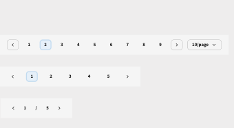
Pagination
Pagination prevents overwhelming users with excessive information at once and improves loading performance for extensive data displays.
Progress indicators
Progress indicators visually communicate the status of an ongoing operation, letting users know that a process is active and how much longer it might take.
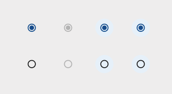
Radio buttons
Radio buttons typically appear as small circles that become filled when selected, ensuring a clear, single choice from the available alternatives.

Rating
Rating elements allow users to provide feedback on a product, service, or content, typically using a visual scale like stars or a numerical score.
Search
Search, typically including an input field and button, allows users to query and retrieve specific data from a larger dataset, bypassing traditional navigation.
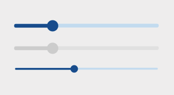
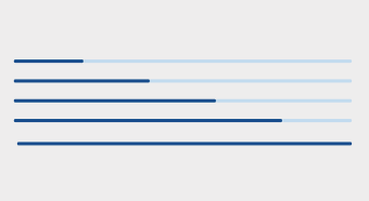
Sliders
Sliders allow users to select a value or range of values by dragging a movable handle along a track and they are ideal for adjusting settings.
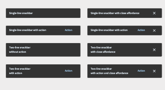
Snackbars
Snackbars are small, temporary messages that appear briefly, usually at the bottom of the screen, to provide concise, non-intrusive feedback.
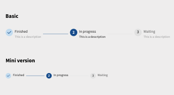
Steps
Steps (or steppers) visually guide users through a multi-stage process by breaking it down into sequential, numbered or titled segments.
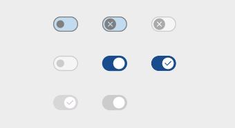
Switch
Switches are toggle controls that allow users to turn a single setting or feature on or off, typically by sliding a thumb between two states.
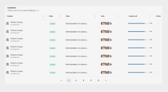
Table
Table display data in a structured grid of rows and columns, allowing for efficient organization, comparison, and analysis of large datasets.

Tabs
Tabs are a navigation pattern that allow users to quickly switch between different views or categories of information without leaving the current context.
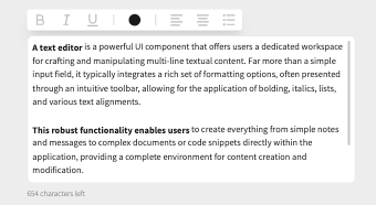
Text editor
A text editor dedicated UI allows for complex content creation, ranging from simple notes to full documents, directly within the application.
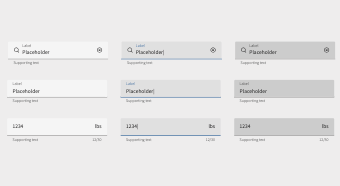
Text fields & Dropdowns
Text fields are input areas where users type in free-form text, used for collecting information. Dropdowns present a list of predefined options.
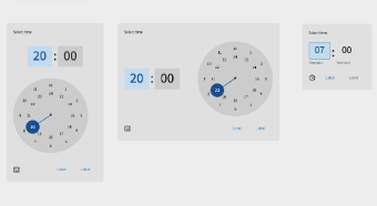
Time pickers
Time pickers allow users to select a specific time, or a range of times, for tasks like setting alarms or scheduling events and standardize time input.
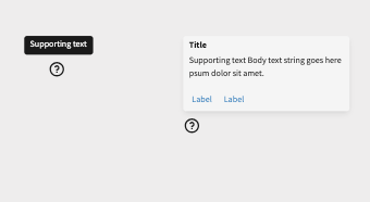
Tooltips
Tooltips are small, contextual pop-up messages that appear when a user hovers over or focuses on a UI element, providing explanatory text or additional information.
Tour
Tour helps new users understand an application's interface and functionality by highlighting specific elements and explaining their purpose in a sequential manner.
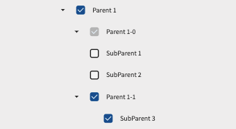
Tree
A tree (or tree view) is a UI component that displays hierarchical data in a parent-child structure, typically with expandable and collapsible nodes.
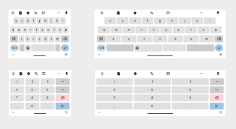
Utilities
Pre-designed interface elements (numeric and text keyboards) for mobile and tablet interactions, ensuring a unified look and feel for data entry across various devices.
Tokens
Design tokens create a single source of truth for design decisions, making your design system more maintainable, scalable, and consistent.