Unlocking a New Wave of Efficiency: Labyrinth UI’s Penpot Variants Update

In our first post, the value of a design system was put under a magnifying glass: it’s not just about looks, but about delivering measurable results - time saved, costs cut, and rapid growth. Today, Labyrinth UI takes that foundation further with an upgrade that taps into Penpot’s component variants - multiplying the ROI for product teams.
Why Do Variants Matter for Real-World UX?
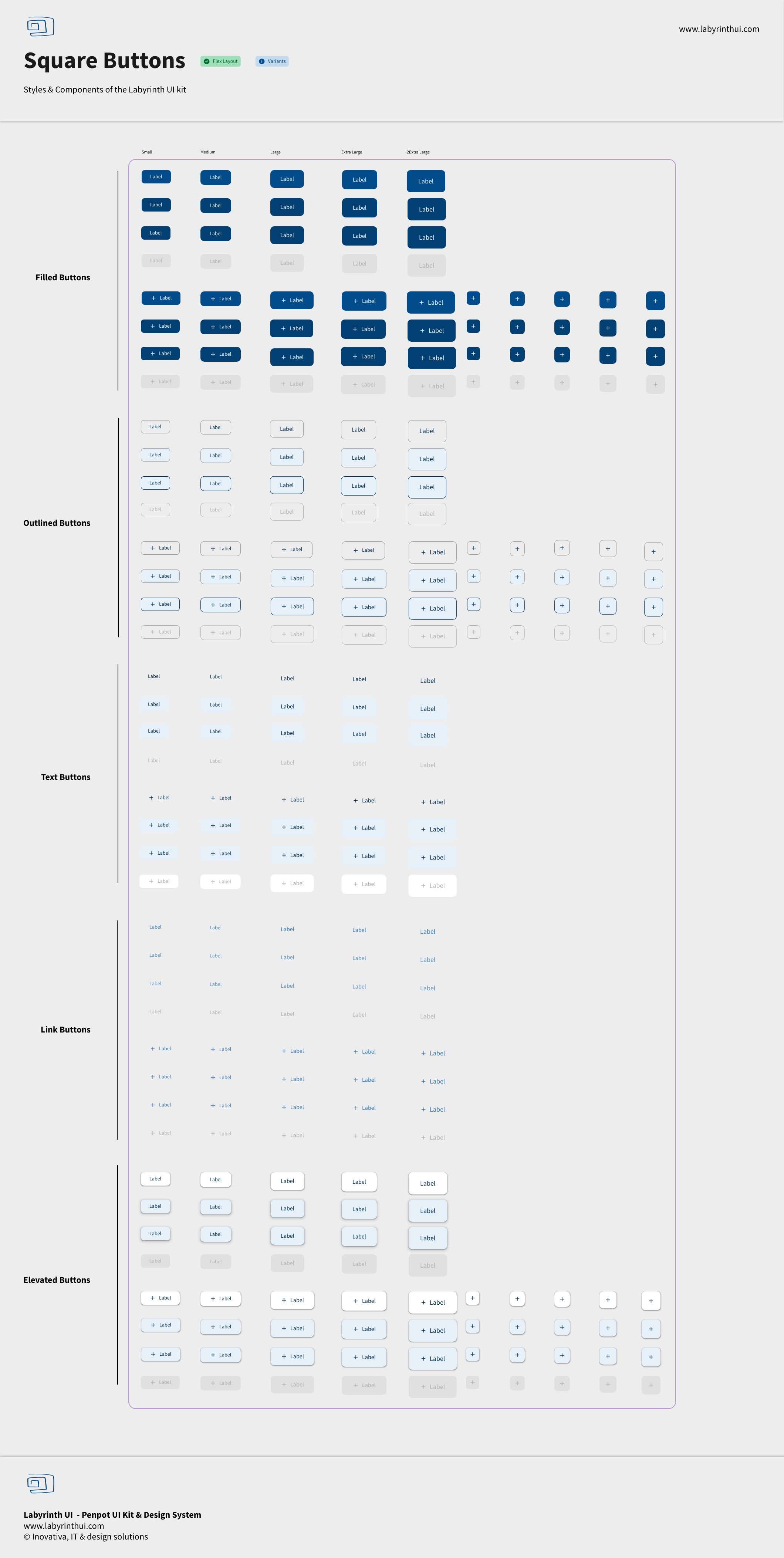
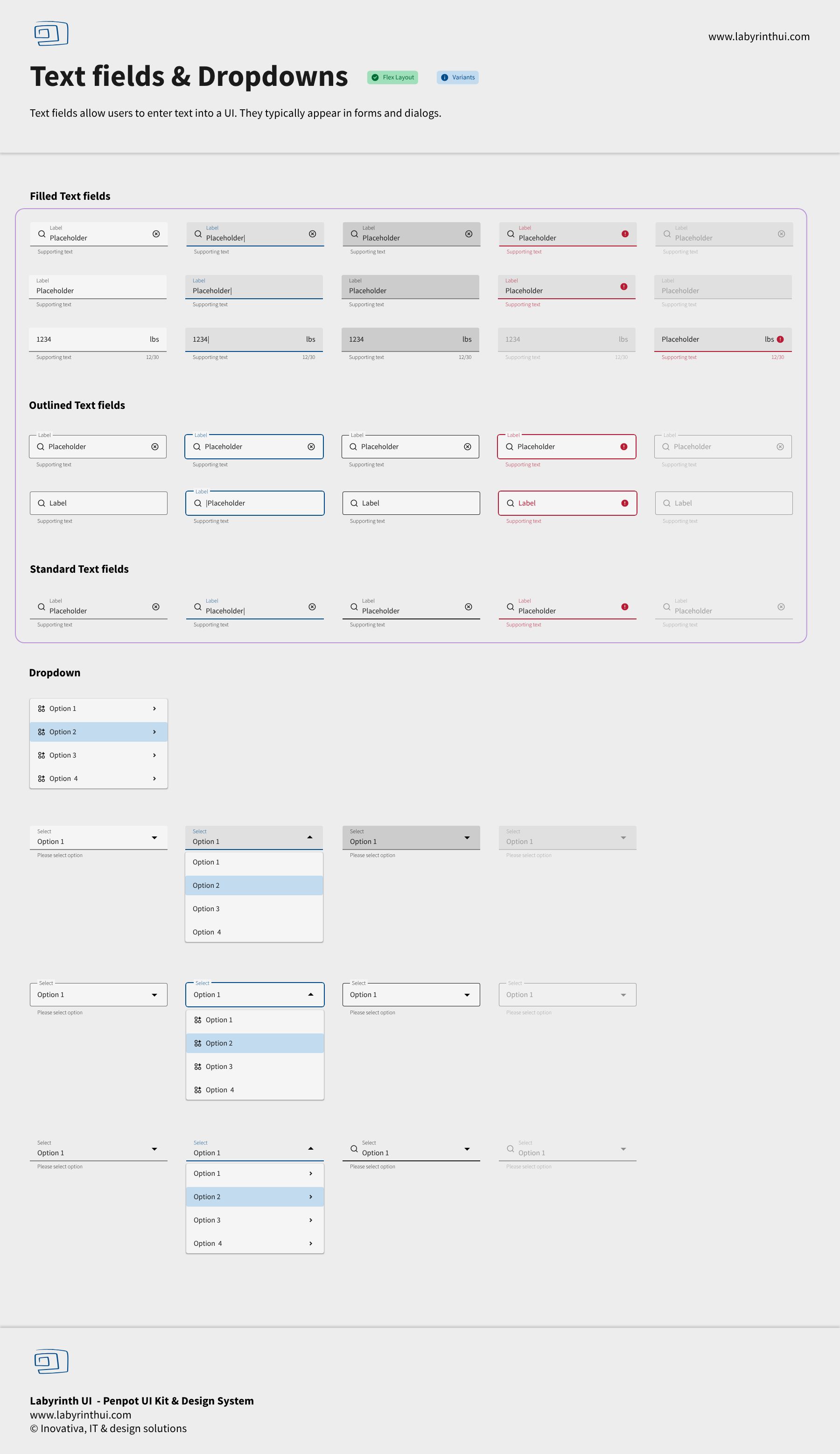
Consistency is only the beginning. As product teams grow, so does the need to customize and scale interfaces without chaos. Variants solve the design “branching” problem: suddenly, it’s easy to maintain different button styles, sizes, or states (like error, warning, or success) from a single source of truth.
Less duplicating, less rework - just quick, focused updates and flawless handoffs.
What Are Penpot Variants?
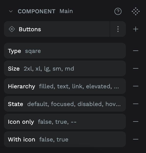
Think of variants in Penpot as smart, powerful collections of your components. Instead of maintaining a dozen near-identical versions, now manage and use all scenarios (colors, sizes, icon choices) from one parent component.
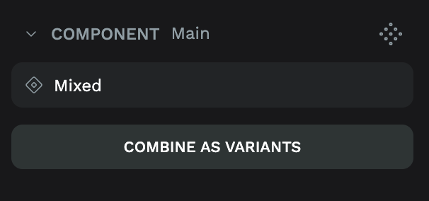
A dotted diamond in Penpot now signals options - pick the look, choose the property, and you're done.
Edits are even smarter: when content is updated, switching variants won’t erase your work.
How Labyrinth UI Raises the Bar with Penpot
Labyrinth UI’s updated kit brings more than 2,000 Penpot-native components into the variants era. Now, building and customizing core screens is faster -choose from pre-built variant groups for buttons, alerts, inputs, navigation, and more.
When teams use these, they see:
Even faster time to production -> skip redundant design steps with each release.
Drastic drop in errors -> Variants force uniformity where it matters - whether a component is light, dark, or somewhere in between.
Effortless onboarding -> New teammates grasp variant logic and become productive almost instantly.
How to Use Labyrinth UI Variants in Penpot
Open the kit and drag a component with a dotted diamond (indicating supported variants).
Select the component and explore the new Variant property picker in the design panel - the right options appear for immediate use.
Need quick changes?
Modify one property, preserve content or overrides, and watch every instance across your file update in sync.
Business Impact: Measurable Gains Multiplied
With the variants model:
Teams are seeing another 20-40% reduction in setup and QA time per feature, on top of previous savings.
Product releases are easier to scale and maintain across brands, themes, and accessibility requirements.
The design-developer workflow is even tighter - developers can reference exact variant names, eliminating back-and-forth.
The Next Step
Measuring, not guessing, makes the value clear. If the first rollout of Labyrinth UI delivered double-digit ROI, integrating Penpot variants will multiply those gains.
Expect higher velocity, better quality, and a design system that grows with your ambitions.
Ready to see how? Download or update your Labyrinth UI FREE Kit or Labyrinth UI PRO Kit and unlock the next chapter of scalable, smart digital product building.
See all